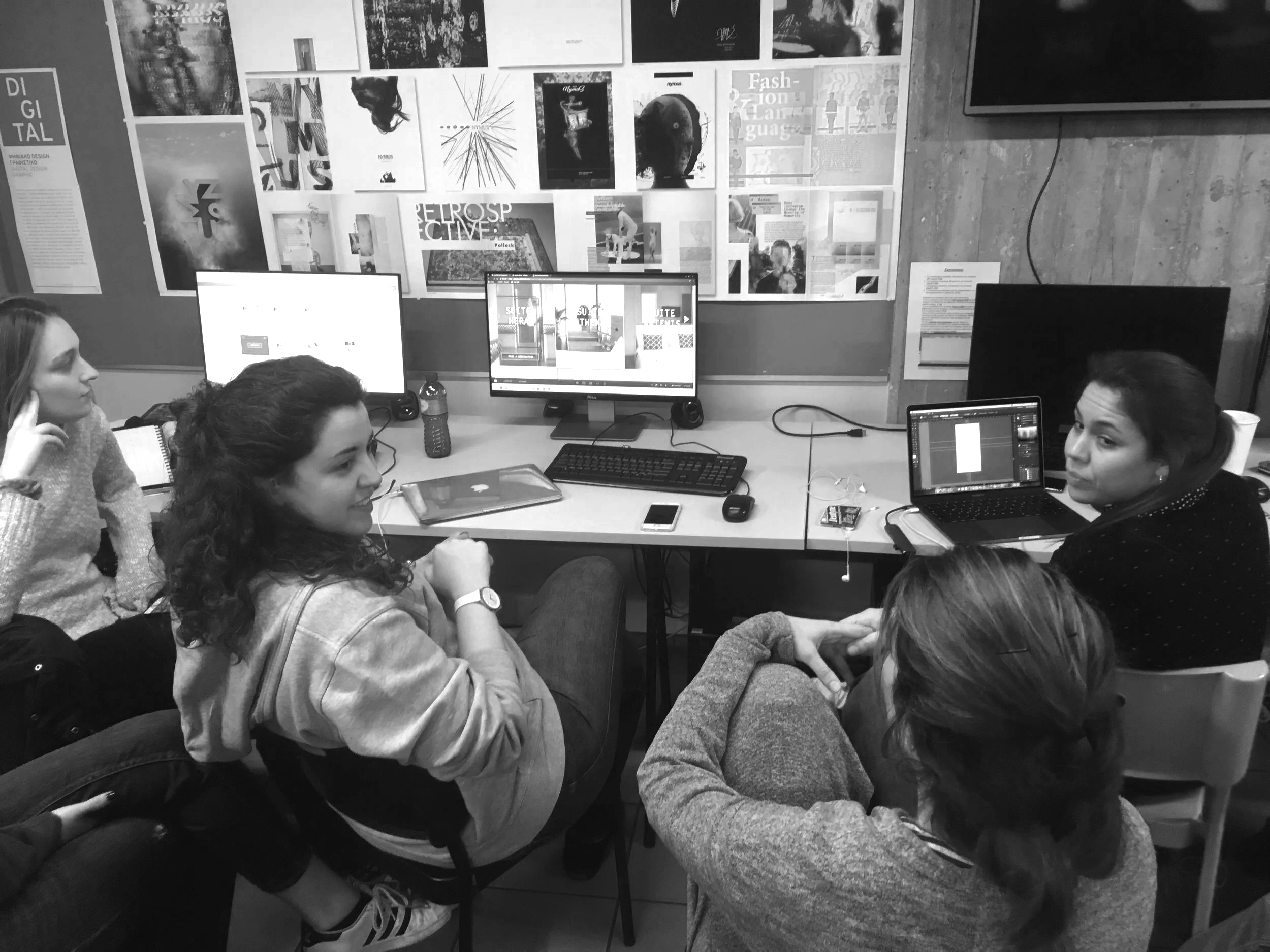
the student who already agrees with you
Every critique has one of these. You point out that the hierarchy is flat, that nothing on the page tells the eye where to land first, and before you finish the sentence they are nodding. Vigorously. "Yeah, no, totally, I knew that, I was actually going to fix that." They agreed with you before you had made an argument. This should feel like a win. It rarely does.
The first lesson I teach every year
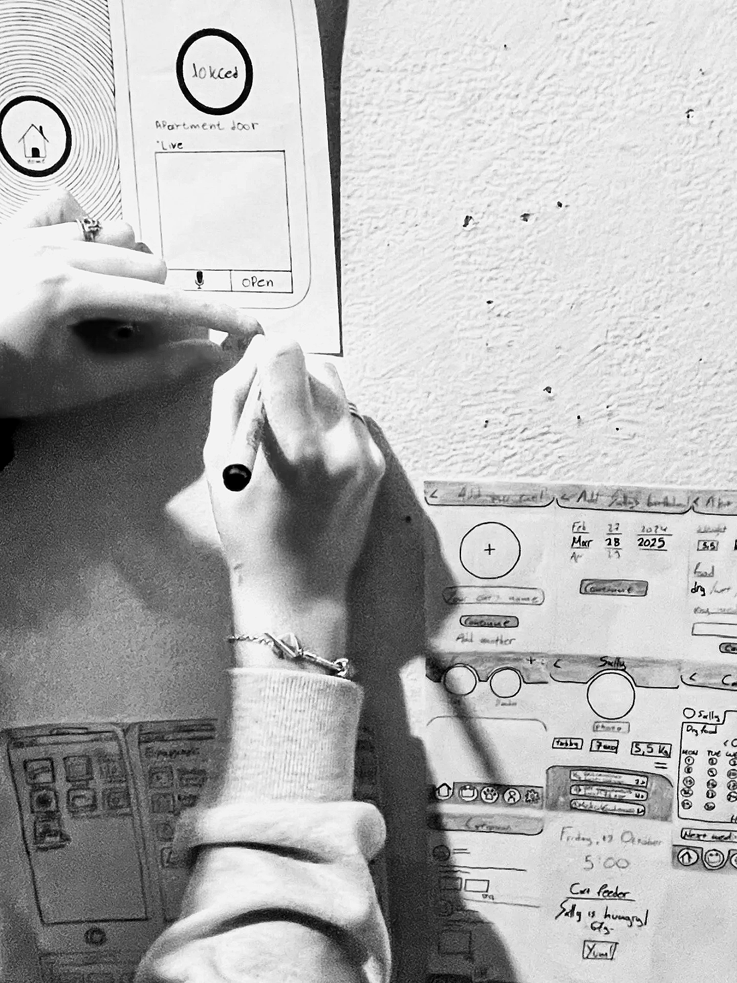
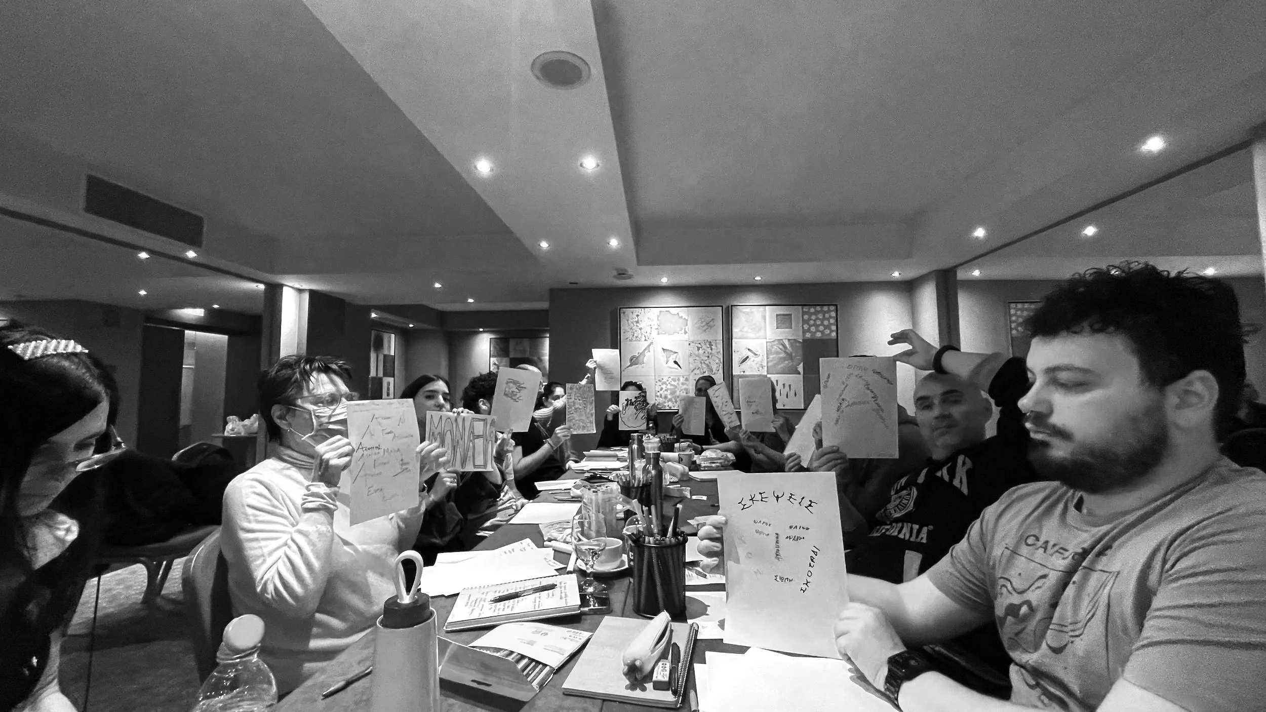
Every year, on the first day of the professional digital design course, I do not open Figma. I do not discuss wireframes. I will not show any slides. In addition, I handed everyone a piece of paper and a pen.
Then, I asked them to draw, from memory, in as much detail as they could, the app or website they used most. The home screen of their phone. Instagram. Their bank app. Google Maps. Whatever lives at the center of their digital day.
On the apology before the work
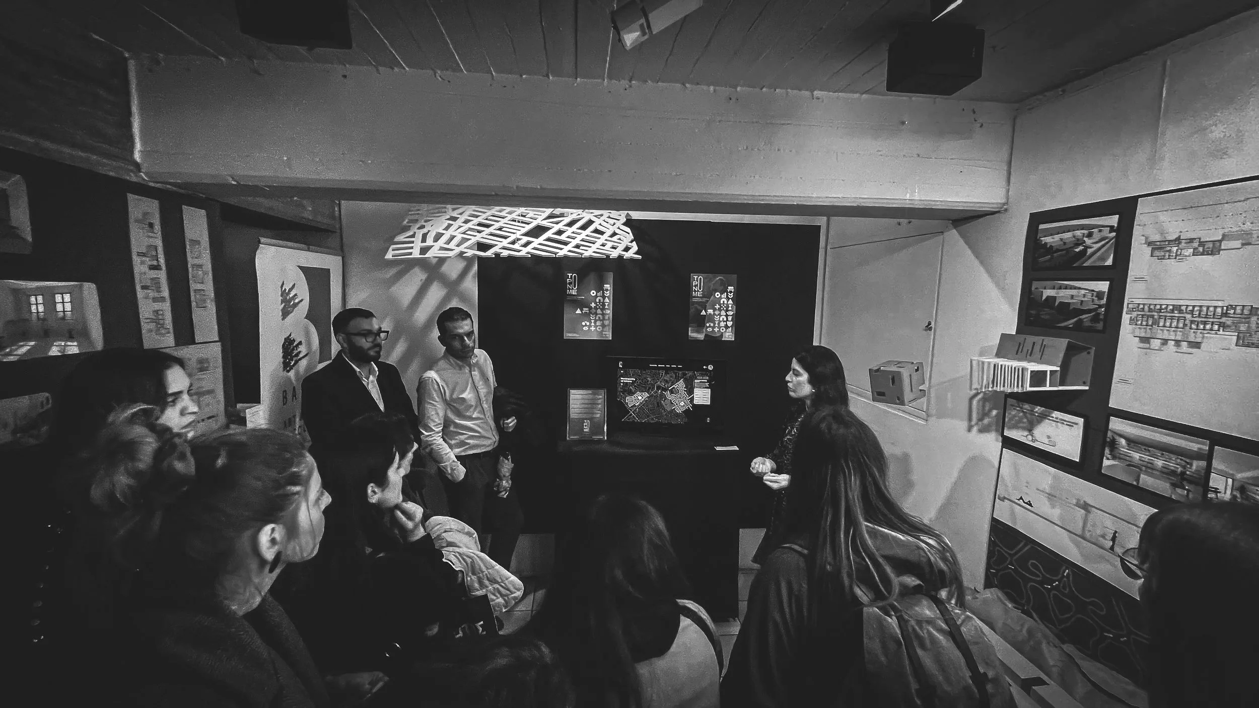
There is a sentence that precedes almost every student presentation, in some form, regardless of the assignment, the year, or how much time they had. It goes roughly like this: "So, I know this isn't finished, I ran out of time, I wanted to do more with the typography, but..." Then they present. Often the work is fine. Sometimes it is better than fine. Occasionally it is the best thing in the room, delivered with the confidence of someone reading their own eulogy.
The difference between clarity and simplicity
There is a tendency in design to equate simplicity with reduction. Fewer elements. Less content. Minimal interfaces. Remove enough, the thinking goes, and understanding will follow.
Sometimes it does. Often, it does not.
Simplicity is a visual outcome, clarity is a cognitive one. They are not the same, and mixing them can make work look thoughtful, but it won't work that way.
On choosing tools
Every few months, a new tool arrives that promises to change everything. A faster way to design. A smarter way to write. A more efficient way to think. The interface is always clean. The demo is always convincing. The promise is always the same: more output, less effort, less time.
Students notice immediately. So do teams. The question follows quickly.
On the work you do not show
Most portfolios tell a story of arrival. The brief. The process. The final outcome. A clean arc from problem to solution, documented with care and presented with confidence. It looks like competence. It is supposed to.
But the work that actually shapes a designer happens largely off the page.