The first lesson I teach every year
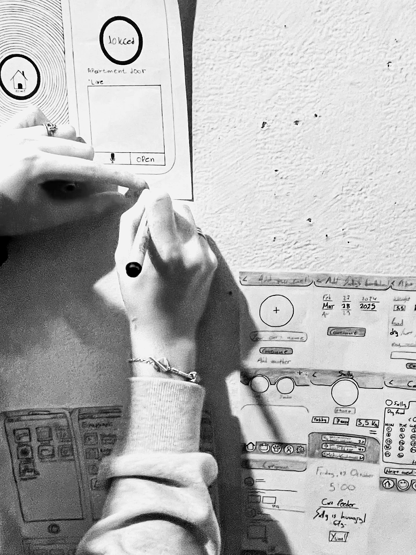
Every year, on the first day of the professional digital design course, I do not open Figma. I do not discuss wireframes. I will not show any slides. In addition, I handed everyone a piece of paper and a pen. Then, I asked them to draw, from memory, in as much detail as they could, the app or website they used most. The home screen of their phone. Instagram. Their bank app. Google Maps. Whatever lives at the center of their digital day.
No phones allowed. No looking. They remember only what they remember.
The drawings are always fascinating. However, this is almost always incorrect. Someone drew the Instagram navigation bar with four icons instead of five. For example, a person may place the search bar at the bottom of their banking app, even though it has been at the top for three years. Someone draws a button that does not exist because, in their mind, it should exist, so they put it there.
The second part follows. They pass their drawings to the person sitting next to them. Please have that person open the real app and correct it, marking what is missing, misplaced, and what has been completely invented. The room becomes very quiet during this part. This is not because it is difficult. This is because it is revealing.
Two things occur in silence.
The first is the lesson of memory. What we retain as users is not photographs. It is a feeling. We remember the things that made us feel something: confusion, relief, frustration, and delight. We remember the button that we could not find. We recall the flow that surprised us. We remember the moment when we almost gave up and the moment when something worked. Everything else, the exact position of every icon, and the precise label on every tab, lives below the threshold of conscious attention. When a design is doing its job, we are not looking at it. We are currently investigating this issue.
The second is the lesson of observation. Correcting a fellow student's drawing requires you to look at something you have used a thousand times as if you are seeing it for the first time. Most people discover, at that moment, that they have never really seen it at all. They have only ever used it once. There is a profound difference between these two things, and it is a difference that determines whether someone becomes a good designer or a great one. Both lessons are important in practice.
As a designer, you will make decisions about things that your users will not consciously notice. That is the goal. However, this means that you have to notice them, with a quality of attention that most people never develop because nothing in daily life demands it. You have to look at an interface the way a proofreader reads a page: not for meaning but for the thing that is slightly, quietly wrong.
You must understand that what users remember is not your design. It is their experience of the design. These are not the same. They live on your screen. The other lives in their body, in the reflex of a thumb, in the half-second of hesitation before a tap, in the small satisfaction of a flow that asked nothing of them. The gap between what you created and what they remember is the entire territory of UX design.
Nine years in. Over 160 graduates have been trained. I still perform this exercise on the first day. Everything I want my students to understand about design lives inside it if they are willing to sit with what the drawings reveal.
A piece of paper and a pen were provided. No Figma required.